Orange
Digital brand expression, modular design system, product design, Iconography design.

Orange talked to customers in France, Spain, Senegal and Poland – places where Orange and their competitors have been growing their businesses – they were told clearly: telcos aren’t listening. Wolff Olins was challenged to help solve this problem by crafting a set of principles that explained the kind of experiences a ‘listening company’ could create.
The Project
Objective.
Deliver design standards and a modular design system enabling countries to create flexible solutions and services. Create clear branded experiences which would help solve customer problems.
Approach.
I spent three works working in the Wolff Olins studio to understand the brand strategy and help define the digital principles. Work closely with product teams to understand the needs of the customer. Create templates and UI components and UX patterns that were adopted by product teams worldwide.
My role.
From concept design to the creation of clear and consistent design templates, UI components and UX patterns.
Understanding
The visual identity.
There were a lot of new visual elements to play with. A new font, accent colours, core shapes, illustrations and a new set of brand images. I love the early concept phase of a project so had a great time working with the guys at Wolff Olins to help define the digital principles of the brand.
Define the design principles
The first step was to define the digital design principles. Here we established rules for the use of the new brand typography, colour, spacing, imagery and iconography. After setting up these core principles we looked at how we could create a modular design system which worked on a 12 column grid and was responsive to cover desktop, tablet and mobile.
Global templates
When creating a design system or component library it is important to understand the digital landscape and how your customers will be using the products and services. What better place to start to test out the new digital principles and visual identity than the country .com site homepage. It was fantastic to hear such positive feedback from both the internal brand team and the agency - Wolff Olins. The modular system appealed to the various country stakeholders, each with very different needs and services.
Results
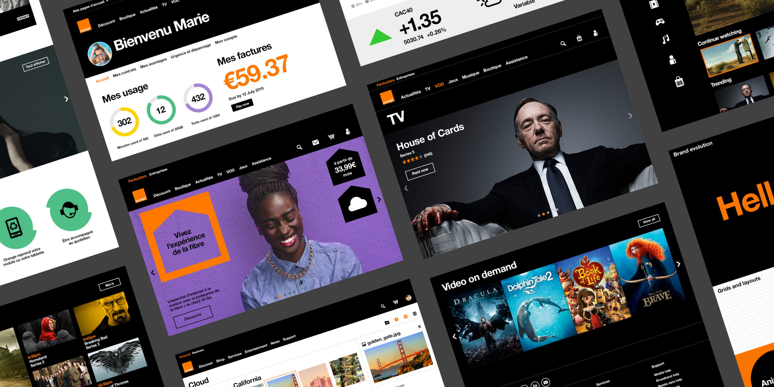
Due to the success of the global templates, we were flooded with requests to be involved in other products and services. This meant setting direction, and creating components and templates for services including My Orange, video on demand, Orange TV, cloud storage and various mobile apps.

Video on demand.
A really fun project involving some collaboration with the on demand team to better understand the UI limitations.
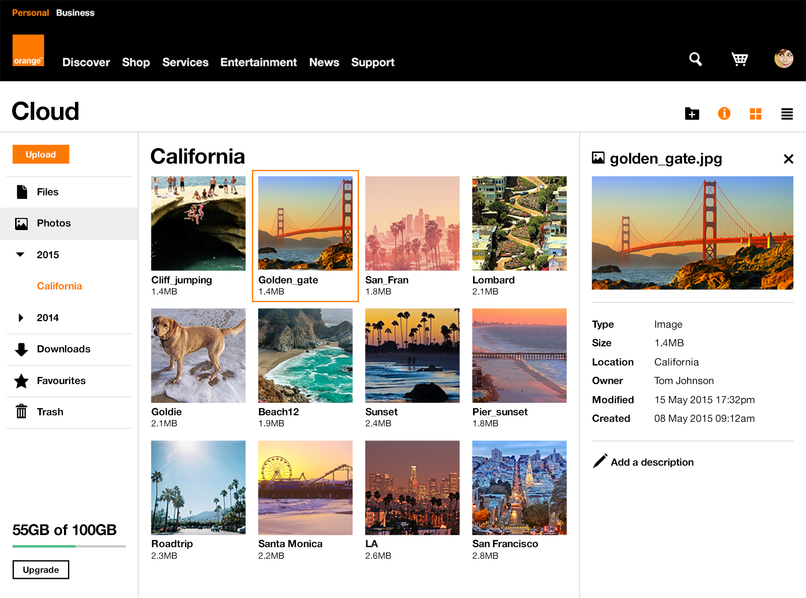
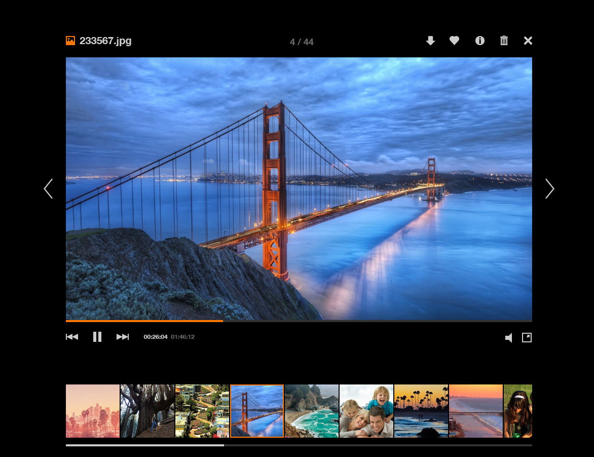
Le Cloud.
A key add on service for mobile users. I worked with the Cloud engineers to enhance the user experience and completely redesign the interface.


Mobile
With Orange being a telecom company the mobile experience was as important as desktop. We created fully responsive web components and an iOS and Android toolkit to help the product teams.


