Refinitiv - Insights
Concept design, enhance the user experience, test and prototype and create final responsive UI.
Refinitiv blog - Insights
Building on the existing Thomson Reuters Finance & Risk blog, newly formed Refinitiv want to enhance the user experience and apply their new brand to create the industry leading blog - Insights.
The project.
Objective.
Thomson Reuters Finance & Risk business has been rebranded - Refinitiv. The new brand would aspire to create the industry leading blog leveraging existing Thomson Reuters content, authors and users.
Approach.
We planned firstly on auditing the existing Thomson Reuters blog. We would also conduct some interviews with existing users of the blog to understand how they used the current blog and if they had any frustrations. We would also run some analytics to understand usage trends and usage by device type.
My role.
Concept design
UX design
Prototyping
UI design & component design
Research
Understanding the user.
Our user researcher arranged a series of early interview sessions with current users of the current Thomson Reuters Finance & Risk blog. The idea was to gain early insights in user types, behaviours and pain points.
Key findings.
Users were often limited by time. Users wanted to see specific category posts and trending or popular topics. Users told us the authors and credibility of the articles were extremely important. Users would read articles by the subject but also because a particular author had written the article. Many users would consume blog posts on multiple device types, either at work, commuting or at home.
Feedback.
Some early content layout options were presented to users in the research sessions using low fidelity prototypes. The feedback highlighted areas for improvement. Some users struggled with the navigation, found problems with the content structure and the hierarchy of information.


Design
Categories should be clearly labelled and easy to find
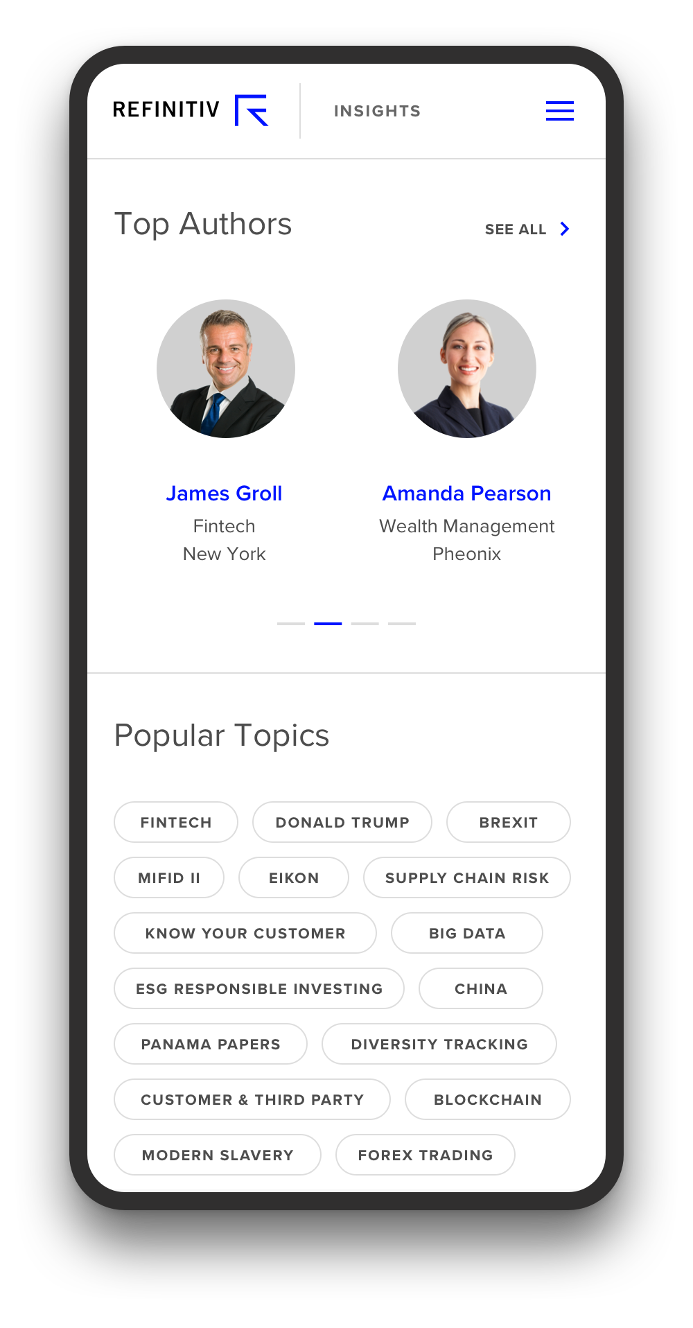
Show me trending posts.
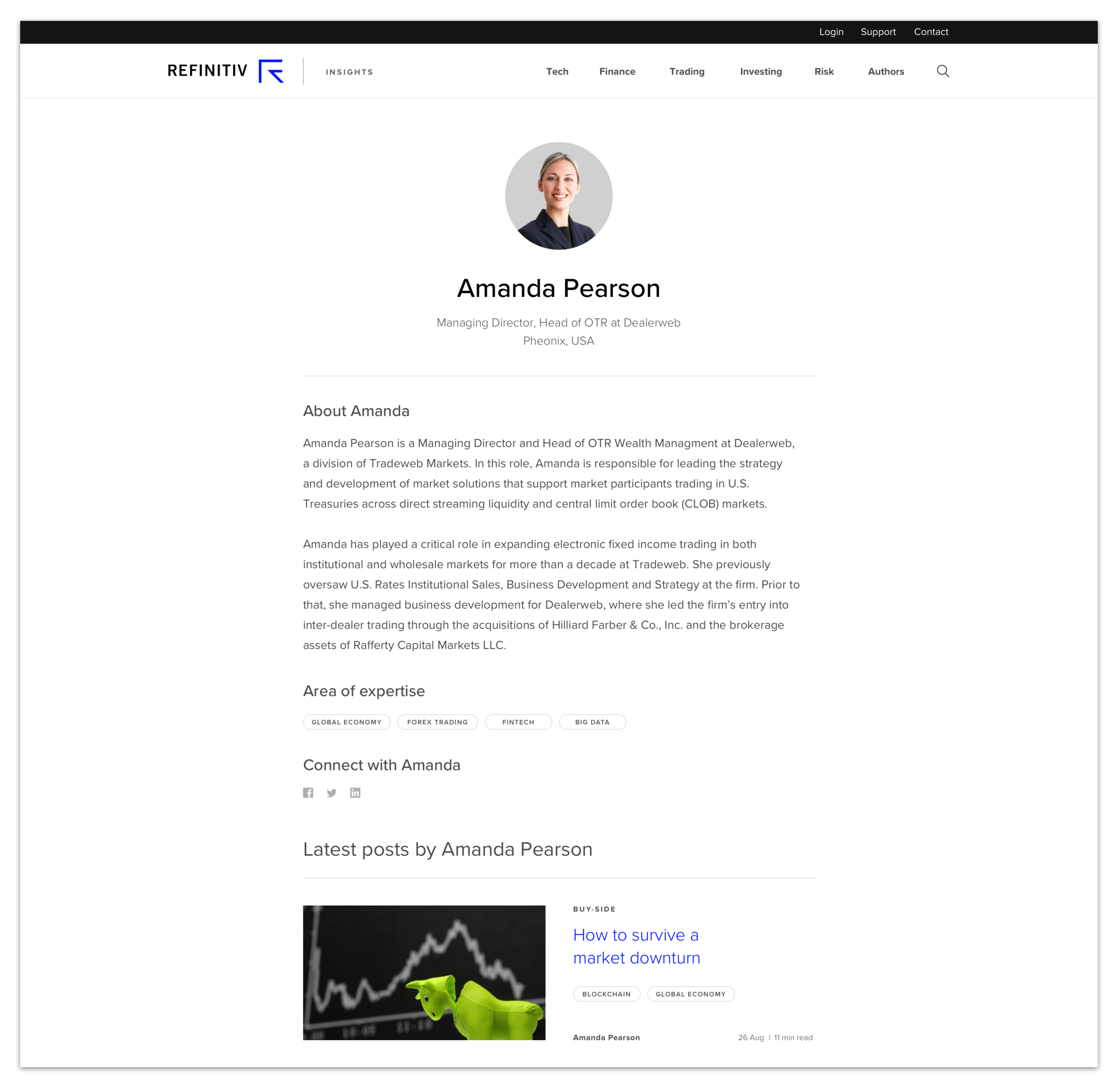
It matters who wrote the article, are they credible authors?
Can I follow my favourite author?
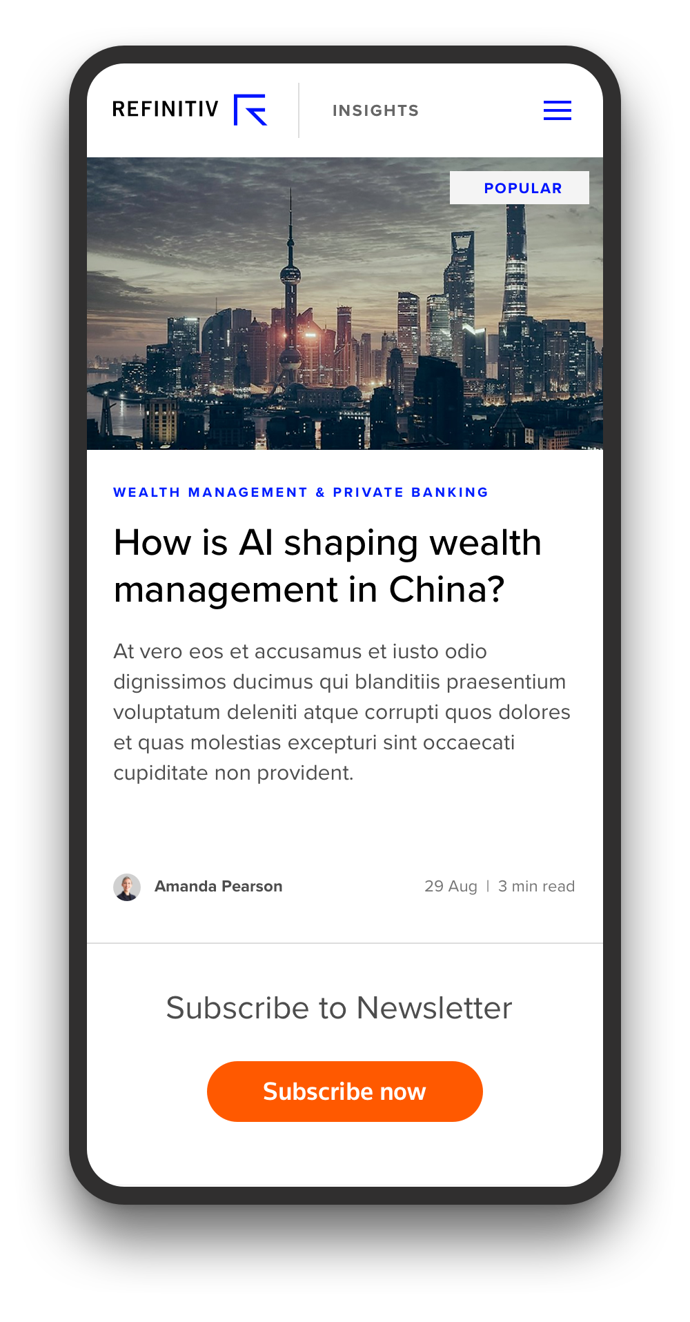
Make it easy to subscribe
I read articles on different devices
I want to know how long each post will take to read
Homepage
The new visual style of the Refinitiv blog are rooted in the three brand principles, Focused, Open and Bold. The design comes to life with careful consideration of typography, colour, space and fantastic photography.
Article
We learned that the article pages were busy and users got distracted. We introduced more generous spacing and adjusted the hierarchy so the focus was on the main article content. We introduced a dynamic sign up to newsletter component giving users to chance to signup on each page. We also introduced a next post towards the top incase users were not enjoying that article. We figured that if users had reached the end of article then they most likely enjoyed it, therefore it makes sense to offer related posts at the end of the article. Users commented that this was a welcome enhancement.
Adding credibility to the blog
Before investing time to read articles, users wanted to know how credible the content writers are. Users wanted to be able to search for a specific author and follow authors who wrote inspiring blog articles.
Users do read blogs on mobile
Early business assumptions were that users don’t read blog articles on mobile devices. We ran some analytics on the current Thomson Reuters blog and asked our users. Almost 20% of the current blog users were using mobile devices.


