Lloyd’s - Digital brand
Develop and own the Lloyd’s digital brand, create a design system and set the direction for product design.

Lloyd’s is the world’s leading insurance and reinsurance marketplace. I was brought in to lead the digital brand team and create a design system from scratch. The design system would feed into all Lloyd’s products and services and define all Lloyd’s digital experiences.
The project.
Objective.
To provide direction for the digital brand within Lloyd’s. Responsible for creating a design system that could scale across the product landscape and enable teams to create beautiful, accessible experiences for the marketplace.
Approach.
I began by getting a good understanding of the brand, the Lloyd’s landscape and the end users of the design system. I worked closely with the brand agency and built strong relationships with the product teams to ensure early adoption.
My role.
I lead a talented team of designers and helped create a documentation site, a component library and direct brand experiences within key flagship products.
Foundations
Working with the product teams to discover the Lloyd’s product landscape, we defined the design principles and set the foundations. Before any components were designed, we created tokens for colour, typography, grids, spacing and iconography…
Colour
One of the most important brand foundations, colour was a key part of our toolkit. We built upon and extended the Lloyd’s digital colour palette to cover the needs of the product teams. A big part of the colour work was to ensure colour and text combinations were AA accessible.

Typography
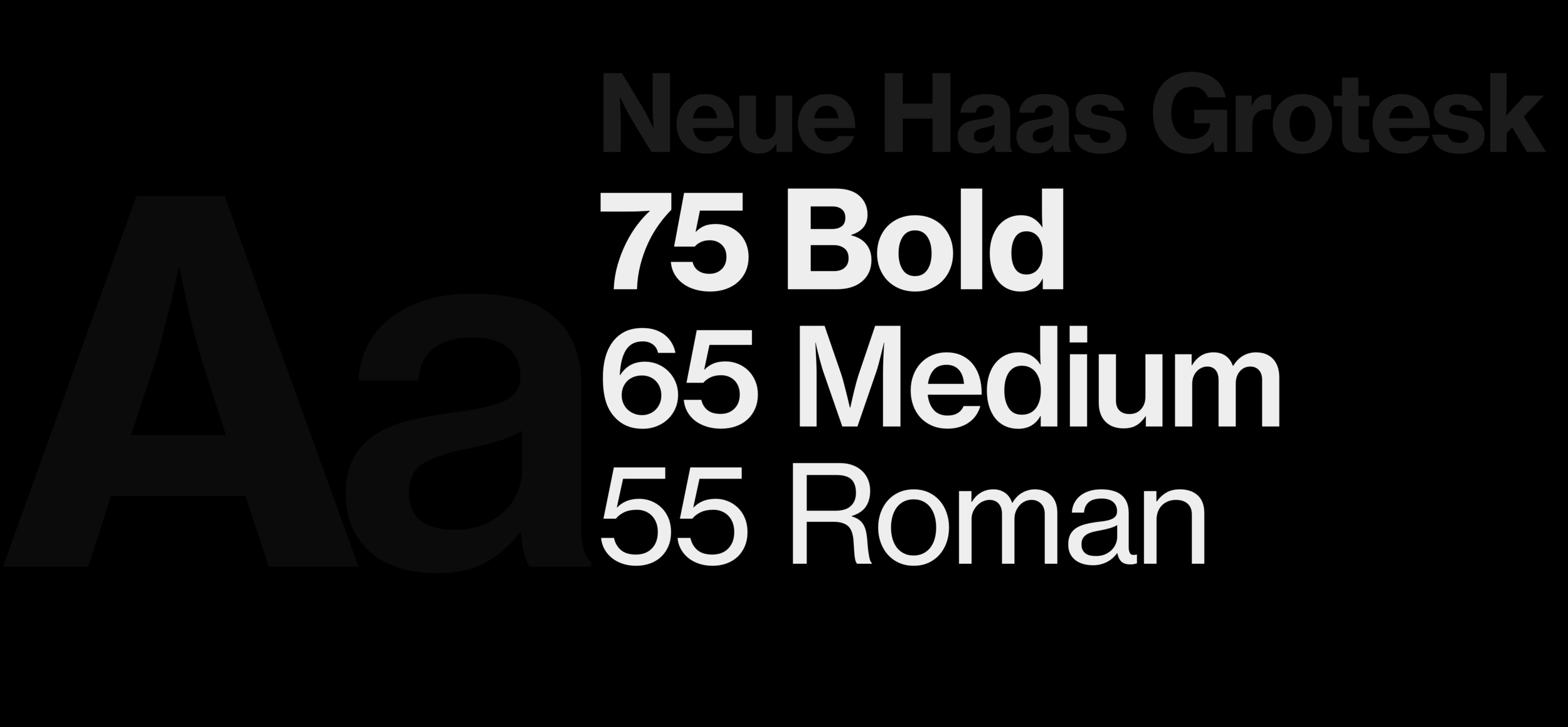
Lloyd’s use one font for all digital products and services in: Neue Haas Grotesk Text Pro. It's clear, confident and versatile, and sits at the heart of the Lloyd’s brand. We defined the new digital type styles and proposed two themes, expressive and productive. The expressive theme used extra large, bold type sizes and generous spacing to create a modern confident look. The productive theme was designed to be used on task based, data heavy products and used tighter spacing and a smaller set of type styles.

Layout
We created a spacing system that brings order and harmony to our digital world. This system helped bring greater levels of control to all device types and sizes.
Iconography
We created a set of icons that’s contemporary, consistent and works well alongside our Typography stack. We use these icons across all our digital products and platforms.
Documentation site
It all begins with an idea. Maybe you want to launch a business. Maybe you want to turn a hobby into something more. Or maybe you have a creative project to share with the world. Whatever it is, the way you tell your story online can make all the difference.
The result
Expressive theme
We created two themes within the design system, expressive and productive. The expressive theme was to enable teams to create bold, engaging experiences using larger type and more generous spacing. The expressive theme was used for marketing material such as lloyds.com and campaign material. Teams could use full bleed images or background video, large typography, colour and motion to tell stories in an engaging confident branded way.

The result
Productive theme
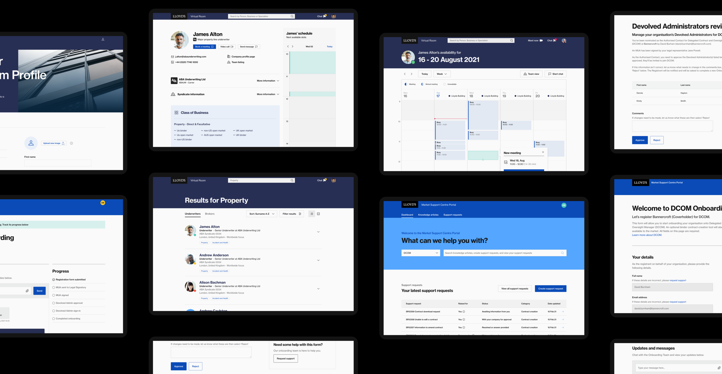
The productive theme offered a selection of smaller type sizes and tighter spacing in order to cater for more task based ‘productive‘ products.

Mobile experience.
It all begins with an idea. Maybe you want to launch a business. Maybe you want to turn a hobby into something more. Or maybe you have a creative project to share with the world. Whatever it is, the way you tell your story online can make all the difference.


